Exploratory Data Analysis: Exploring the Data Distribution
Each of estimates sums up the data in a single number to describe the location or variability of the data. It is also useful to explore how the data is distributed overall.

by Muhammad Reyhan Arighy Data Scientist
Percentiles and Boxplots
In "Estimates Based on Percentiles" section from Exploratory Data Analysis: Estimates of Variability article, we explored how percentiles can be used to measure the spread of data. Percentiles serve as a valuable tool for summarizing an entire data distribution. It's common practice to report quartiles (25th, 50th, and 75th percentiles) and deciles (the 10th, 20th, ..., 90th percentiles), which provide insights into both the central and wider ranges of the distribution. Moreover, percentiles are particularly advantageous for comprehending the tails, or the extremes, of the distribution. This concept extends beyond statistics and has even found its way into popular culture, where the term "one-percenters" is coined to refer to individuals who belong to the top 1 % in terms of wealth.
Example: Percentiles of Engagement Rate in Percent
Table below shows data set containing a number of views and associated engagement rate (ratio of total likes and comments per total views) for each category in US Youtube trending videos.
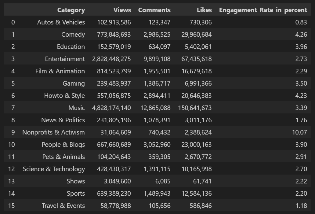
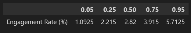
The median is 2.82 %, although there is quite a bit of variability: the 5th percentile is only 1.0925 % and the 95th percentile is 5.7125 %.
BoxplotsA plot introduced by Tukey as a quick way to visualize the distribution of data.
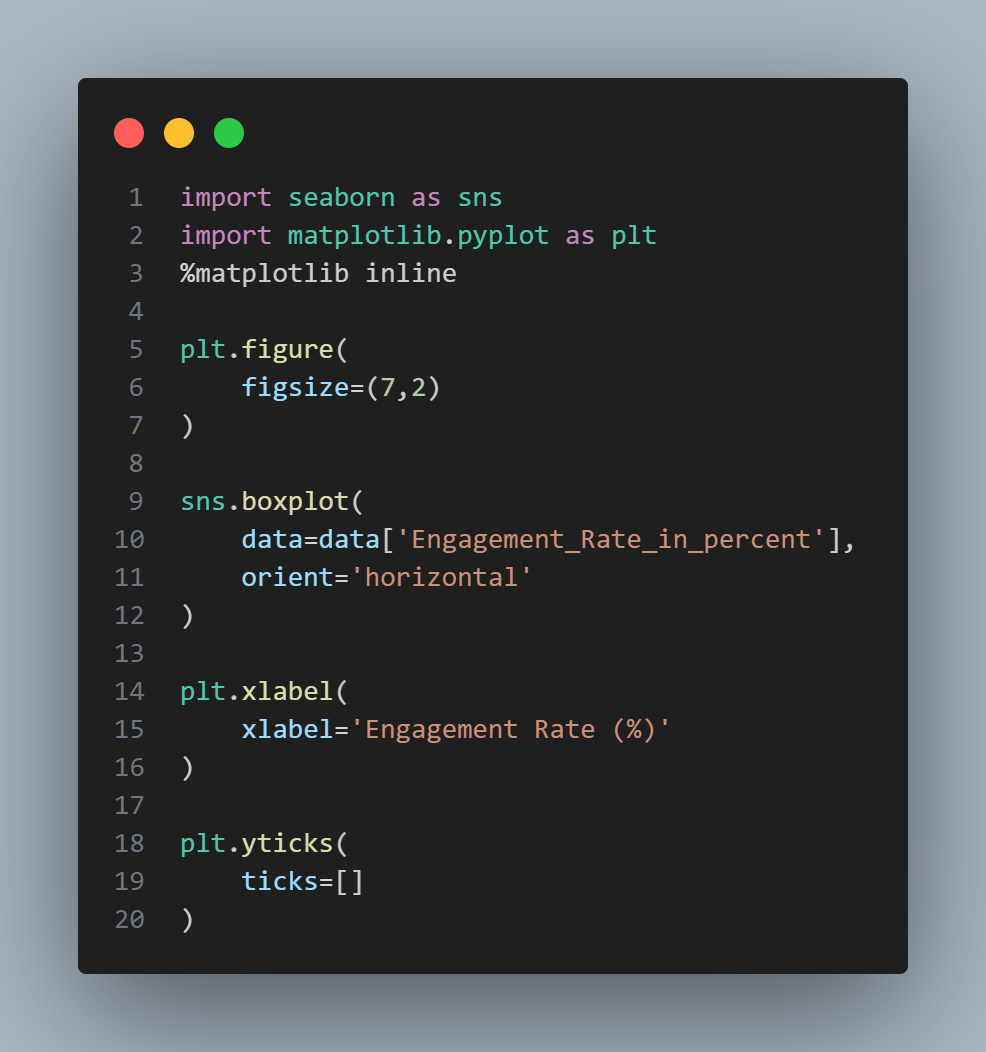
Synonym: box and whiskers plot, as introduced by Tukey in 1977, rely on percentiles to offer a swift and effective means of visualizing data distribution. Figure below shows a boxplot of the engagement rate in percent provided by Seaborn which provides a number of basic exploratory plots for data frame; one of them is boxplots. It is a Python visualization library based on Matplotlib and provides a high-level interface for drawing attractive statistical graphics.
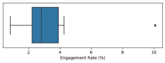
From this boxplot, we can swiftly pick up valuable insights about the data distribution. The median engagement rate appears to be approximately 2.8%, signifying the midpoint of the data. Approximately half of the engagement rates fall within the range of 2% to 4%. However, there is an outlier with a significantly higher engagement rate.
The left and right sides of the box represent the 25th and 75th percentiles, respectively, providing a clear picture of the interquartile range. The median is indicated by a vertical line inside the box. The horizontal lines extending from the box, often referred to as whiskers, reveal the range encompassing the majority of the data points.
It's worth noting that there are various variations of boxplots, and you can refer to the documentation for tools like seaborn.boxplot and matplotlib.pyplot.boxplot for more options. By default, the whiskers extend to the furthest data points within 1.5 times the interquartile range (IQR), although different software may employ alternative rules. Any data points lying beyond the whiskers are typically considered outliers and are often plotted as individual points.
Frequency Tables
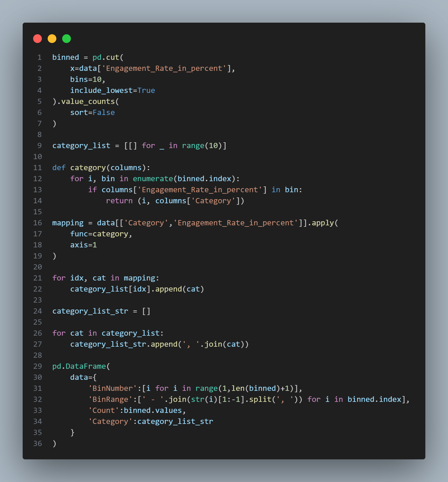
A frequency tableA tally of the count of numeric data values that fall into a set of bins or intervals. of a variable divides the variable's range into equally spaced segments, also known as bins or intervals, and provides information about how many values from the dataset fall within each of these segments. Based on the previously shown table of US Youtube trending videos, the function pandas.cut creates a series that maps the values into segments. Using the method pandas.DataFrame.value_counts, we get the frequency table:
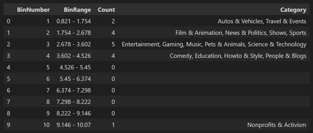
The analysis reveals that the category with the least engagement is Autos & Vehicles, with an engagement rate of 0.83 %, while the most engaging category is Nonprofits & Activism, with an engagement rate of 10.07 %. This provides us with a range of engagement rates spanning from 0.83 % to 10.07 %, which equals 9.24 percentage points.
To create a meaningful frequency distribution, we decide to divide this range into equal-sized bins, for example, using 10 bins. Each bin will have a width of 0.924 %. It's important to note that in this process, some bins may remain empty. However, the presence of empty bins is valuable information because it indicates that there are no values falling within those specific segments of the data, helping us understand the distribution more comprehensively.
Additionally, it's worth considering different bin sizes when constructing frequency tables. If the bins are too large, important characteristics of the distribution may be obscured. Conversely, if the bins are too small, the data becomes overly granular, making it challenging to see the broader trends in the distribution. Balancing the bin size is crucial to gaining a clear and informative representation of the data.
Equal-sized or Equal-count Bins?
Both frequency tables and percentiles summarize the data by creating bins. In general, quartiles and deciles will have the same count in each bin (equal-count bins), but the bin sizes will be different. The frequency table, by contrast, will have different counts in the bins (equal-sized bins), and the bin sizes will be the same.
Histograms
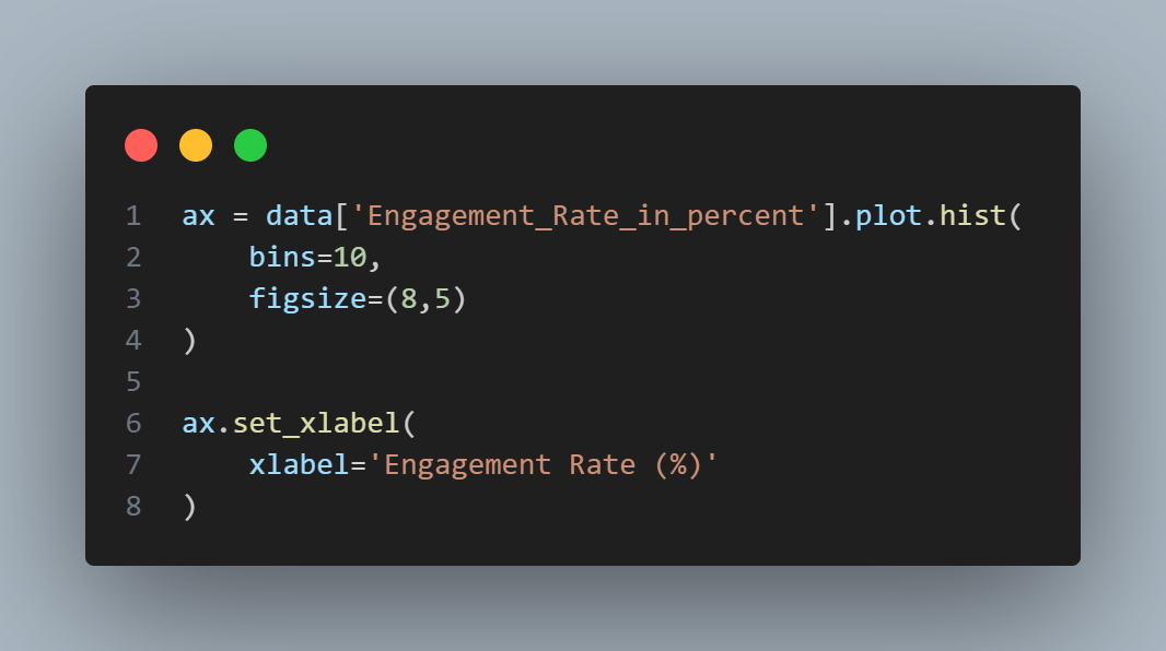
A histogramA plot of frequency table with the bins on the x-axis and the count (or proportion) on the y-axis. While usually similar, bar charts should not be confused with histograms. is a way to visualize a frequency table, with bins on the x-axis and the data count on the y-axis. To create a histogram corresponding to the previous frequency table above, use pandas.Dataframe.plot.hist method with the keyword argument "bins" to define the number of bins.
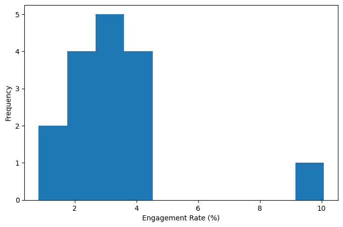
The histogram is shown in figure above. In general, histograms are plotted such that:
Statistical Moments
In statistical theory, location and variability are referred to as the first and second moments of a distribution. The third and fourth moments are called skewness and kurtosis. Skewness refers to whether the data is skewed to larger or smaller values, and kurtosis indicates the propensity of the data to have extreme values. Generally, metrics are not used to measure the skewness and kurtosis: instead, these are discovered through visual displays such as figures shown previously.
Density Plots and Estimates
Related to histogram is a density plotA smoothed version of the histogram, often based on a kernel density estimate., which shows the distribution of data values as a continuous line. A density plot can be thought of as a smoothed histogram, although it is typically computed directly from the data through a kernel density estimate. Figure below displays a density estimate superposed on a histogram. Pandas provides the pandas.DataFrame.plot.density method to create a density plot. Use the argument "bw_method" to control the smoothness of the density curve.
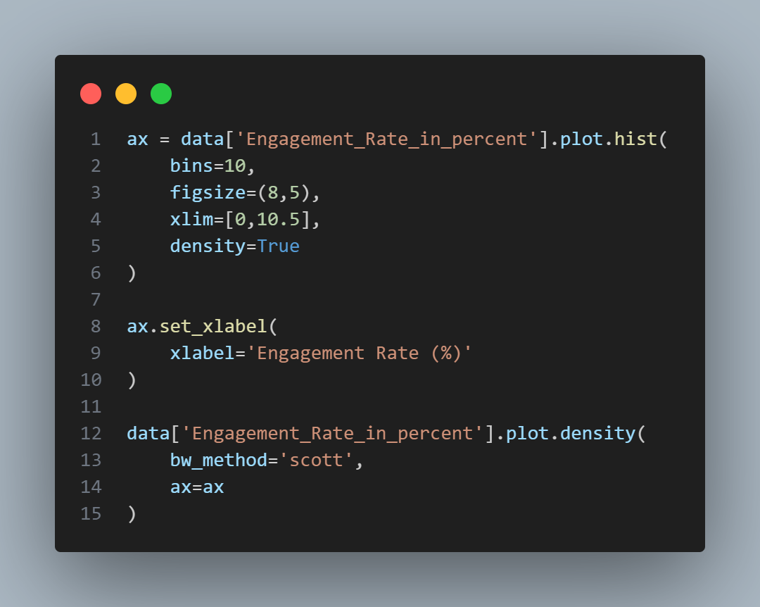
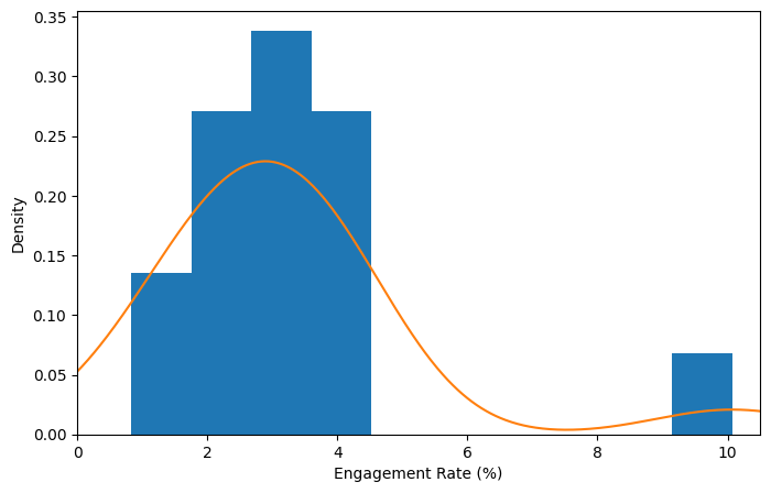
A key distinction from the histogram plotted previously is the scale of the y-axis: a density plot corresponds to plotting the histogram as a proportion rather than counts. Note that the total area under the curve is equal to 1, and instead of counts in bins you calculate areas under the curve between any two points on the x-axis, which correspond to the proportion of the distribution lying between those two points.
Density Estimation
Density estimation is a rich topic with a long history in statistical literature. In fact, the density estimation methods in pandas and scikit-learn offer good implementations. For many data science problems, there is no need to worry about the various types of density estimates; it suffices to use the base functions.
Key Ideas
Further Reading